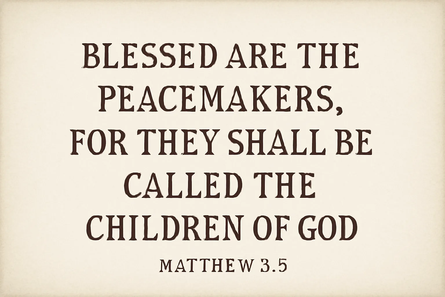
A verse poster is a piece of wall art that highlights a short poem, lyric, couplet, or memorable line of text—often paired with complementary typography, imagery, or abstract shapes. This type of artwork is sometimes referred to as a poetry poster, a verse art print, or a lyric poster, depending on the emphasis of the design. The core idea is to render language into a visual form that can be read at a glance while also serving as an expressive element within a room. Whether used to celebrate literature, carry a personal motto, or mark a moment in time, a well-crafted verse poster blends typography, layout, and material choices to communicate mood as effectively as the words themselves.
In the modern design landscape, verse posters span a wide spectrum—from strictly typographic takes that foreground the cadence and rhythm of a line, to mixed-media interpretations that weave illustration, texture, and color with the poem. The versatility of a verse poster makes it suitable for homes, classrooms, studios, and offices. The aim of this guide is to help you understand how to design and print beautiful verse posters by covering strategy, typography, composition, color, materials, printing technologies, and practical workflows.
Why design a verse poster?
Designing a distinctive verse wall print can sharpen your design skills, give you a tangible way to celebrate literature, and provide a thoughtful gift option. A well-designed verse poster can:
Enhance readability while preserving the poetics of the verse.
Create an emotional resonance through typography and color.
Serve as a statement piece in a room or workspace.
Offer a versatile format that scales from small desk prints to large wall posters.
Bridge text and visual art to appeal to a broad audience.
Key concepts for verse poster design
A successful poster design relies on a few core concepts. Keep these in mind as you draft your project:
Hierarchy: establish a clear reading order with the verse as the focal point.
Typography as voice: choose typefaces that reflect the tone of the verse.
Color that supports mood and readability.
Spacing and rhythm: line breaks and letter spacing influence pace.
Contrast for legibility, especially from a distance.
Material and finish that suit the display environment and budget.
Design principles for verse posters
When you embark on the design of a poetry poster, treat the words as the first instrument and the page as the stage. The following principles help ensure your project reads well and feels intentional.
Typography as the core voice
The typography you select should reflect the character of the verse. For a formal, classic line, a serif typeface can lend gravitas; for a modern or casual vibe, a geometric sans-serif or a hand-drawn script might be more appropriate. Consider these pairing ideas:
Classic juxtaposition: a serif main type paired with a clean sans for supporting lines.
Elegant minimalism: a single high-contrast display face with generous tracking.
Playful lyric posters: a rounded sans + a simple script for emphasis.
Kerning and tracking adjustments can dramatically alter readability, especially for long verses or dense blocks of text. Ensure that the line length remains comfortable; aim for roughly 40–70 characters per line for printed posters, depending on size and typeface. In practice, this often means adjusting line breaks by hand to preserve rhythm and natural pause points in the verse.
Color and mood
Color choices influence mood and legibility as much as typography does. Here are guidelines to help you craft the right atmosphere:
Warm palettes (reds, oranges, yellows) convey energy or intimacy.
Cool palettes (blues, greens, purples) suggest calmness or reflection.
Muted earth tones can evoke nostalgia or seriousness.
High-contrast palettes improve readability from a distance.
Limited palettes keep the focus on the verse; multiple hues can highlight key phrases.
Consider the venue for your verse poster. A living room corner may benefit from warm, welcoming tones, while a creative studio might invite more saturated, high-contrast color. If you’re uncertain about color, start with a color palette that includes a dominant hue, a secondary accent, and a neutral baseline.
Choosing the content: selecting the verse
The text you feature on a verse poster should be purposeful and ethically sourced. Here are practical steps to curate content:
Use short, quotable lines that fit the selected poster size to avoid crowding.
Prefer verses with strong cadence and clear meaning when read aloud.
Stay mindful of copyright and licensing. For contemporary or recognizable lines, obtain permission or use in the public domain.
Prototype with multiple options to compare tone and legibility before finalizing.
Consider original verses or user-generated quotes to add a personal touch.
A verse print can also function as a single line highlight or as a set of lines that create a visual arc across the poster. Some designers designate the most important word or phrase as a focal point through size, color, or typographic treatment.
Layout and composition for verse posters
Layout is the architecture of your poster. A thoughtful composition makes the verse legible and visually compelling. Below are layout strategies commonly used for printable verse posters.
Grid-based composition
Use a grid system to align text and graphic elements. A simple 4-column or 6-column grid provides structure while leaving space for breathing room. Rules of alignment keep lines visually connected and improve perceived quality.
Line breaks and rhythm
Where you break lines affects pace. Place line breaks at natural pauses in the verse, not merely to fill space. This practice helps readers experience the cadence you intend.
Hierarchy and emphasis
Establish a hierarchy that guides the eye: the most important phrase or the title should stand out, followed by the main verse and then any ancillary lines or attribution. Use size, color, and weight to create this order.
Typography pairings for verse posters
The right pair of typefaces can elevate a verse poster from legible to memorable. Here are practical pairing patterns:
Serif for the primary verse with a sans-serif for supporting lines.
Display serif with a clean sans for a contemporary classic look.
Script or hand-drawn display for emphasis, paired with a sturdy sans or serif.
Mono or geometric sans for a minimalist aesthetic when the verse is short and crisp.
When choosing fonts, test legibility at the final print size. Avoid pairing two high-contrast display faces for long passages; reserve them for short phrases or headings.
Materials and finishes for verse prints
The physical nature of a poster print affects how it feels and how long it lasts. Materials and finishes influence color accuracy, texture, and handling. Common options include:
Paper stock: matte, satin, or gloss finishes; weights typically range from 80 lb to 300 g/m² (or 170–400 gsm for heavier posters).
Texture: smooth, vellum, or lightly textured surfaces add tactile interest without sacrificing legibility.
Finishes: matte coatings reduce glare; satin or semi-gloss strikes a balance between color depth and clarity.
Specialty options: metallic or textured papers for a unique, premium effect.
Edge treatment: straight-cut, rounded corners, or custom die-cut for branding or a distinct feel.
For wall stability and color fidelity, quality paper and a suitable coating are essential. If a verse print will be displayed under bright light, a matte finish reduces glare and improves readability at different viewing angles.
Printing techniques for verse posters
The printing method you choose can transform the final look and cost of your poetry posters. Each technique has strengths for different aims, from quick, affordable runs to gallery-worthy finishes.
Digital printing
Digital printing is versatile and cost-effective for short runs. It supports vibrant color ranges and precise typography, making it a popular choice for small-batch verse posters, proofs, and custom orders.
Inkjet and giclée
High-quality inkjet printers, commonly used for giclée prints, deliver excellent color depth and subtle gradients. This method is ideal for artful posters with photographic elements or soft tonal transitions.
Letterpress and offset options
For a tactile, vintage, or premium feel, consider letterpress or offset printing. Letterpress creates a tactile impression in the paper that enhances the typographic texture, while offset printing is efficient for larger runs with consistent color.
Screen printing
Screen printing offers bold, saturated color and is excellent for posters with strong flat areas of color or limited color palettes. It can be cost-effective for mid-sized runs and adds a handcrafted aura.
Preparing your files for print
Proper preparation ensures your verse poster prints with fidelity to your digital design. Key steps include resolution, color management, bleed, and file format considerations.
Resolution: design at 300 DPI (dots per inch) at final size to prevent pixelation.
Bleed and safe margins: include at least 0.125–0.25 inches (3–6 mm) of bleed beyond the trim line; keep important text at least 0.25 inches (6 mm) from the edge.
Color mode: convert to CMYK for most commercial printing needs, or supply with a Pantone library if precise color matching is required.
File format: use print-ready PDFs with embedded fonts and high-resolution images; avoid compressing line art or raster images excessively.
Embed or outline fonts to prevent substitution issues, and include a fonts file list if supplying non-standard typefaces (or use a PDF with embedded fonts).
Tools and software for creating verse posters
A range of tools can help you craft professional-looking verse posters. The choice depends on your comfort level, budget, and whether you value vector precision, photo editing, or hand-drawn elements.
Vector-based design: Adobe Illustrator, Affinity Designer, or Inkscape for crisp typography and scalable layout.
Raster and photo editing: Adobe Photoshop, Affinity Photo, or GIMP for image-based backing or texture work.
All-in-one design: Adobe InDesign or Affinity Publisher for multi-element layouts and easy typography control.
Creative sketching: Procreate or Clip Studio Paint for hand-lettered verses integrated into posters.
Web-based tools: Canva or Figma for quick layouts, especially useful for prototyping verse poster concepts.
Case study approaches: variations of verse posters
Designers often explore several directions when creating a collection of verse posters. Here are common approaches you might consider or adapt:
Typographic focus: the verse is framed by strong typographic treatment, with minimal or abstract graphics, emphasizing rhythm and word shapes.
Illustrated verse: the text interacts with illustrations, icons, or decorative elements that echo the theme of the words.
Photographic backdrop: a photographic image provides mood while typography sits in the foreground, balancing clarity with atmosphere.
Monochrome and high contrast: a restrained palette highlights contrast and legibility, creating a bold, timeless piece.
Hand-lettered style: a human touch through custom lettering or brush script adds warmth and personality.
Practical workflow: from concept to print
Here is a practical workflow you can adapt for designing and printing verse posters, whether you’re working solo or as part of a design team.
Define the brief: audience, purpose, size, and budget.
Source the verse: obtain rights if necessary and select multiple options for comparison.
Choose the format: determine the final size(s) and whether a single poster or a small series will be produced.
Sketch layout ideas: rough compositions to explore line breaks, typography scale, and graphic elements.
Draft typography: select typefaces and begin pairing, test legibility at final size.
Refine color palette: establish a primary color, an accent, and a neutral, then test in grayscale for readability.
Produce a proof: create print-ready files with bleed, trim marks, and embedded fonts; request a physical proof if possible.
Print and review: check color accuracy, clarity, and alignment; adjust if needed and reprint as necessary.
Budgeting and production considerations
Your budget will influence every aspect of the project—from the choice of paper to the printing method. Here are considerations to help you plan.
Print quantity: small runs for personal use are more economical with digital printing, while larger runs may benefit from offset or specialty processes.
Material costs: higher-weight papers and specialty finishes add to the cost but can dramatically improve the tactile and visual impression.
Color management: accurate color reproduction may require proofs and calibrated equipment.
Licensing: ensure you have rights for the verse, imagery, or fonts you use.
Framing and presentation: include costs for frames, mats, or mounting hardware if the final display is framed.
Displaying and preserving verse posters
Once you have your verse print, consider display strategies that maximize impact and longevity.
Choose frames that complement the poster’s color and style while protecting the print from light and moisture.
Mount posters on acid-free backing or in UV-protective glass to prevent color fade.
Consider a rotating gallery wall with interchangeable verse prints to keep spaces fresh.
Use proper lighting: avoid harsh direct sunlight; opt for ambient lighting that highlights typography.
Common mistakes to avoid
Even experienced designers encounter pitfalls when creating verse posters. Being aware of these can help you deliver a polished product.
Overcrowding the layout with too many words or decorative elements, which reduces legibility.
Choosing overly similar typefaces that clash or create visual noise.
Ignoring accessibility: insufficient contrast or inappropriate font sizing for readers at a distance.
Neglecting bleed and safe margins, which leads to awkward cropping or misalignment after trimming.
Relying on a single color or ornamentation without testing in grayscale for accessibility and print versatility.
Accessibility in verse posters
Accessibility is essential for widest possible audience reach. Here are practices to improve legibility without compromising design:
Use high-contrast color pairs for text and background.
Maintain adequate line height (leading) to reduce crowding between lines.
Provide larger formats or alternative text accommodations for critical messages when used in digital contexts.
Offer versions in multiple font weights or sizes for different display environments.
Case studies: sample design scenarios
To illustrate the possibilities, here are three hypothetical design scenarios for verse posters:
Minimalist typography poster: A short, powerful line set in a bold display font, with generous white space and a single accent color to draw attention to the most important word.
Nature-inspired poster: A verse overlaid on a soft, photographic landscape, with subtle color grading to harmonize text and image while preserving readability.
Hand-lettered focal point: The main line is hand-lettered or brush-script, paired with a clean sans-serif for the supporting text, creating warmth and modernity at once.
Frequently asked questions
Answers to common questions about verse posters and their creation:
What size should I choose for a verse poster?
Common sizes include 8×10, 11×14, 16×20, and 18×24 inches. Choose based on display location and legibility at typical viewing distances.
Do I need professional printing for a verse poster?
Not always. For personal use or practice, high-quality inkjet printing at home or in a local print shop can be sufficient. For gallery-quality results or large formats, professional printing with proofs is advisable.
How can I ensure the verse is legally used?
Use verses in the public domain, obtain permission from the author or rights holder, or use original writing. Always verify licensing requirements for fonts and imagery.
What file format should I deliver to a printer?
A print-ready PDF with embedded fonts, bleed, and color profiles is standard. Some printers may accept TIFF or high-resolution PDFs; check with your service provider.
Conclusion: embracing the craft of verse posters
A compelling verse poster blends the beauty of language with the precision of design. By attending to typography, color, layout, and print considerations, you can craft posters that stand up to close study and distant viewing alike. Whether you are creating a single poetry poster to celebrate a favorite line or building a small series that explores a shared theme, the process rewards careful planning, thoughtful experimentation, and a respect for the source text.
As you begin or continue your exploration of verse wall art, remember that the ultimate goal is to make the words feel inevitable and the page feel alive. The right combination of type, color, and texture can transform a simple verse into a keepsake—an object that invites reflection, sparks conversation, and enriches the space it occupies.